set of three posters, all designed to advertise the new sticker pack for cupple. All three designs feature the sticker designs in the backdrop, and have the titles created to look like stickers themselves placed on top. I think these turned out pretty nice, mainly down to the way the placement of the type brings the posters together.
Three mood boards looking at Prefab77 who create a lot of collages, using half tones and black and white work, real gritty looking stuff. Don Pendleton, the polar opposite to prefab77, he uses a lot of flowing smooth lines, using a lot of block colours to produce to pretty abstract work. Finally, a sticker wall collage, just highlighting the most used styles of sticker.
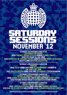
My three final Ministry of sound poster designs, all using three seperate styled backgrounds, and all based around complimenting colour schemes, to really try and make the type on the posters pop out more. The top one is my favourite colour wise, however the composition of the bottom poster is the best in my opinion.
A bit of self branding, looks pretty rad in my opinion. Purple is the best colour, and that is why I chose it. Japanese text is supposed to say "super awesome", although it probably doesn't, because I used google translate to generate it, it's probably closer to "egg fried rice". I think the entire thing just fits together nicely.
Final book cover with all of the blurbs and quites and what have you added on. My favorite part of this book cover is the spine, because I detest this, I didn't have a real idea of what I wanted to do throughout the entire project and I think it reflected in my work. If I had to change anything about this book cover, it would be everything. Except the spine.
The first set of developed ideas for one flew over the cuckoos nest book cover, the main idea behind this was to give it a really gritty and decayed looked, sort of like an indications as to the mental states of some of the characters in the book. the initial Idea was made from cardboard, and painted roughly with oil based paints, so it would look rough when it was scanned in.
Subscribe to:
Comments (Atom)


