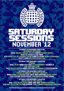
My three final Ministry of sound poster designs, all using three seperate styled backgrounds, and all based around complimenting colour schemes, to really try and make the type on the posters pop out more. The top one is my favourite colour wise, however the composition of the bottom poster is the best in my opinion.
A bit of self branding, looks pretty rad in my opinion. Purple is the best colour, and that is why I chose it. Japanese text is supposed to say "super awesome", although it probably doesn't, because I used google translate to generate it, it's probably closer to "egg fried rice". I think the entire thing just fits together nicely.
Subscribe to:
Comments (Atom)


