Ministry of Sound - Saturday Sessions Revamp


Redoing my Saturday sessions was quite a bit of fun, I really enjoyed my initial 8-bit styled designs, but I felt I could add something much more to them.
I tried to concentrate on producing as much of the assets for the poster by myself, including the type, to try and match the overall retro arcade feel.


Blaydon Tennis Club revamp.

Again, I was going through past projects, looking at things that I felt had promise, and could become quite attractive designs if they were spruced up a bit, and in particular, I felt that my Tennis Club project would really benefit from this. 
My original designs, I felt were viable, and could be used commericially, however, I don't think they have that wow factor, they just seem rather bland, and fairly standard, so I wanted to make something a little different to what other sporting clubs used as their branding.


Paisley Design.

A paisley pattern that I initially tried to make work for my design by humans brief. I tried to make a more westernized version of an eastern design,  however didn't really work out as a single colour design, as it just ended up looking a bit flat and unattractive, so I tried to spruce it up a bit and add a bit of colour in to help it pop a bit more.
Not really sure what It could be used for, but I like it.

Cupple Sticker pack revamp.

Whilst looking through older projects, I felt most of them could now be vastly improved as my skills as a designer has progressed greatly. The project that I thought would benefit the most from this was the sticker pack I produced for Cupple, which initially featured emoticon style food items.


I used a mixture of original sketches, with new idea's to help me reproduce my first design set.
I finally recreated my initial submission, focusing more on the facial expressions rather than the overall design,  trying to create stronger emotions and facial expressions. I also really liked my ice cream designs, so I decided to take a different approach and produce a series of different cones.


Design By Humans.

To try and add something a little different into my portfolio, I searched for some competition style briefs. The one I chose to go for was on the design by humans website, which runs constant competitions for t-shirt design, and gives designers a chance to win cash prizes and get their work recognised and judged by peers.

The competition, I chose to enter was simply called 'one colour', which required a design featuring one colour to be submitted for voting, obviously the colour of the t-shirt could feature as a secondary colour.

I chose to base my idea's around bizarre news articles, after reading a few odd things, online that tended to feature outlandish claims, or baseless facts.


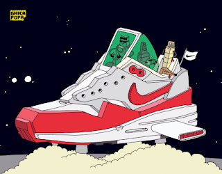
Ghica Popa - Galactic Airmax

Illustrator and artist Ghica Popa, put an intergalactic twist on nike's air max silhouettes, showing that they truly are out of this world as a solid classic running shoe.
Ghica, uses models such as the air max 1, jordan 3 and jordan 4, to showcase his favourite sneaks in his own cartoony graphic style.


Mimi Leung adidas originals display.


A commission for  Australian retailer Platypus Sneaker store in Melbourne

When it came to creating the piece, Leung wanted to push the use of the neon lighting by using fluoro colours to make the display change dramatically at night. A group of collaborators came up with the idea of using 3D elements, and so the display was built up from three separate layers; a printed backdrop featuring Leung’s main illustration, cut-out vinyl pieces for the various characters, and the neon lighting itself. The shoes were then placed to interact with the characters and to add to the flow and dynamism of overall the piece.

Matt Stevens & Nike.

Nike, recently commissioned  designer Matt Stevens to expand upon a piece he created as a tribute to his favourite sneakers, the air max 1.


 Stevens challenged himself to create as many visual interpretations of the Air Max 1 as he could imagine. This led him to utilise an enormous range of visual concepts and mixed media, ranging from shoe-shaped pancakes to a car air freshener. To coincide with the recent release of the Air Max Enginered Mesh series, Nike asked Stevens to expand upon his original subject matter and apply his experimental approach to the four most classic Air Max silhouettes; the Air Max 1, Air Max 90, Air Max 95 and the Air Max 97.


Survivalist Band Branding

I was approached by Survivalist about creating them a nice piece of branding, to match their groovy deathcore style band, but wanted something to get away from the status quo, of unreadable, unattractive spiked messes that most bands of the genre used.
I went out of my way to try and create something with a touch of class, but had enough about it to be able to set itself apart from the crowd.

 I started out by trying to play off the name 'survivalist', by trying to include mountains and tree's to help with their identity, as I found it would be fitting. However, they didn't enjoy my initial ideas, but quite enjoyed the stylized serif texts and asked me to just use that, as a standalone text logo.


Pins Artist

On my trawlings across many social media's I came across an illustrator/designer, go goes by the alias of 'Pins Artist'. 
Much like myself, he has a passion for sneakers and clothes, and this really comes through in a lot of his works, where he uses a lot of mixed media, including screen printing, acrylics, photography, and actual trainers.

Self Branding


I thought it would be wise to finally give myself a recognizable brand to which people could associate quality designs, and a level of freshness that was unique to myself.

I started out like any good designer would, with a pen, and a single piece of paper. I drew out a number of hand written logo styles, aiming for something that would be more street oriented, I didn't want to have a clean logo or ident, it's far too corporate and doesn't represent me as an individual.
The name "siman32" is a one I've used for many years, and it only took me a matter of seconds to settle on it. It's origin comes back to a time many years ago, during a heated game of guitar hero, when entering my name into the hi-scores I accidentally misspelled my name, although it was clearly intentional as it represents my manly manness. Also 32 is just my lucky number.

www.siman32.co.uk 

Seb Lester talk.

So, Seb Lester came in and gave us a little sneak preview of a talk that he was set to be giving around the country at our college.

The main things that I took on from his little talk, was that to be super successful in your own area of work, you have to really be willing to put the hours in, and be on top of what you're doing 24/7, and eat, breath and live what you do.  
Also you have to be a little bit weird, and a little bit awkward apparently. 

Seb, is probably best known as a type artist and illustrator, having produced typefaces for clients such as Apple, Nike, Intel, The New York Times,
The 2010 Vancouver Winter Olympics and JD Salinger's final
reissue of The Catcher in the Rye. 


I found that his talk actually helped me to begin to produce a higher standard of work, by giving me the motivation to actually put the time in to practice what I do, and strive to start putting out the best work that I can. 

Digital Applications

My digital applications PDF is too big to display, so I can't embed it into my blog, so here is a link to it if anybody wished to download it: Download here

Final Designs.


First draft ideas.


Blaydon Tennis Club - Initial research


Final Design sets- Urban Outfitters.


Sticker Ideas - Urban Outfitters


As an example of the versatility of my pattern designs, I applied them to a series of different products, which could be used as a running theme through the whole package experience, matching thank you cards, and stickers to the boxes with the same design.


First Finalized Ideas. - Urban Outfitters

I really liked the idea of aztec/navajo styled patterns as a design, so looking at my mood board, and further research, I produced a set of designs, and chose my best three to take forward as actual ideas.